
- Name the patient or the treatment in the headline, as toofus does with "We help people who are losing teeth".
- List each dentist's qualifications with the university or professional association that awarded them. Most patients don't know what the letters after a dentist's name mean, but they can look up a university.
- Publish your prices and explain in detail what each price includes. Make sure every price matches across pages, so patients aren't left unsure what they'll pay.
- Give emergencies their own button, as Fokas does, so a patient in pain doesn't have to hunt through a menu.
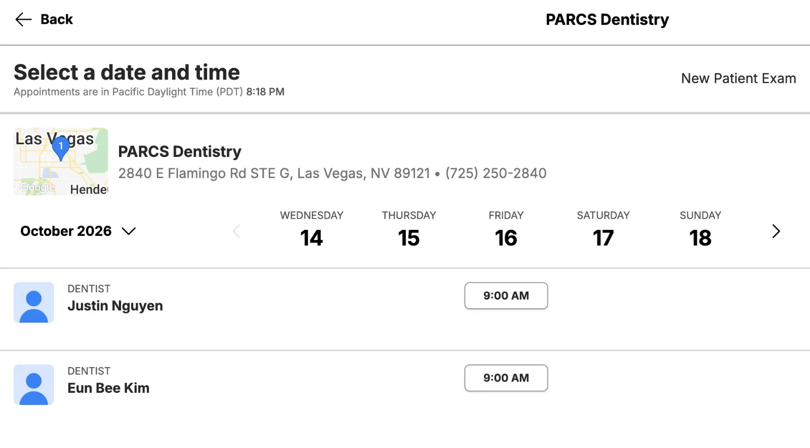
- Show real appointment times before asking for contact details, as PARCS does, and keep the booking page in the same language as the rest of the site.
If you're about to brief a web design agency on your dental clinic's new website, real examples make it easier to say what you want. These five dental website design examples, from toofus Dental, Fokas Dental, Marylebone Smile Clinic, LAVA dental studio and PARCS Dentistry, each get a different part of the patient's journey right.
We followed each of these dental website examples from the homepage to the booking screen, the way a patient would, to see what your clinic can take from each one.
1. toofus Dental, Singapore
toofus is a group of four clinics in Singapore that focuses on missing and failing teeth. Its site names its patient plainly and puts most of its prices on one page. Prices are in Singapore dollars.

Good to copy: a headline that names the patient
The headline reads "We help people who are losing teeth eat, smile and live again". Underneath, a second line says "Whether you have put off seeing a dentist in 2 years or 20". A nervous patient learns in one screen who the clinic helps and whether it's for them.
Naming the patient clearly also helps search, because good seo web design starts with the words patients actually type.
Just below sit the price tiles: "Restore Teeth From $0 after Medisave" and dentures "From $290". The visitor gets a rough cost before clicking anything.
Good to copy: implant prices split three ways
The treatment cost page splits each implant price into three columns: what the patient pays, what Medisave covers and the total. Medisave is Singapore's national medical savings scheme.
A Megagen implant shows $0 out of pocket, a $1,950 subsidy and a $1,950 total. A Straumann implant shows $1,080, $1,950 and $3,030.
The page also prints the small costs: X-rays are included, a 3D scan is $55, and the consultation is $30. The homepage adds "Second opinion consultations are never charged", so a patient comparing clinics can ask without paying anything.

To improve: refine the details to win more enquiries
Three small details on toofus's price pages make the prices harder to believe. None would make a patient leave on its own, but the price page is the one the patient trusted most.
- A price row that doesn't add up: the gum treatment row, "Chao Pinhole Gum Rejuvenation", shows 3,000 per quadrant out of pocket, a 1250 subsidy and 1750 per quadrant total, which puts the out-of-pocket figure above the total.
- One implant, three entry prices: the notice bar above the menu says "$128 NETT (after Medisave subsidy)", while the homepage tile and the cost table start at $0.
- Two consultation fees: $30 on the cost page, $28 on the appointment page.
Keep the three-column split. Check every price against every other page before it goes live.

2. Fokas Dental, Hong Kong
Fokas Dental is an aesthetic and implant practice in Central, Hong Kong. Its homepage opens on a video of the clinic's dental work, and its About page does the most to earn trust.

Good to copy: show each dentist's credentials
The founder's bio covers a whole career: Dr George Fokas graduated from the University of Athens, trained in prosthodontics and implant dentistry in Germany, and held a fellowship in dental implants at the University of Amsterdam.
He then became Assistant Professor of Implant Dentistry at The University of Hong Kong, and he's a Fellow of the International Team for Implantology (ITI).

Every dentist's qualifications sit under their photo, such as "Specialist in Oral & Maxillofacial Surgery" and "MDS (Endo) (HK)". Two small fixes would make the team page stronger.
First, "MDS (Endo)" means a Master of Dental Surgery (MDS) in endodontics, the branch that covers root canal treatment, but the page never says so. Second, Dr Jeffrey Chang's card still shows the site's placeholder icon instead of a photo.

Sidenote:
Hong Kong and Singapore restrict testimonials and clinical photos on a clinic's own website, so named dentists and their qualifications carry the trust that reviews carry elsewhere.
Good to copy: a separate emergency button
Book an Appointment and Emergency sit side by side in the header, so a patient in pain doesn't hunt through a menu. The contact page goes further: it gives a separate WhatsApp and phone number for appointments outside business hours, labelled "EMERGENCY APPOINTMENT (outside business hours)".
The whole site also has a complete Traditional Chinese version, which matters in Central, where some patients read Chinese more easily than English.

To improve: say "dental" in the hero
"Crafting smiles with precision and artistry" hints at dentistry, but nothing in the hero says dental, implants or Hong Kong. The button reads "Schedule your private consultation", which might just as well sit on a skin clinic's site.
The quickest fix is the button: "Book a dental consultation" stays short and tells a first-time visitor what they're booking.
3. Marylebone Smile Clinic, UK
Marylebone Smile Clinic is a cosmetic practice on Harley Street in London. It makes qualifications and prices easy to check, but its homepage guarantee runs into its own conditions on the fees page. Prices in pounds sterling.

Good to copy: accreditation explained in a sentence
The team page lists "Dr Sahil Patel" with "BDS ABACD MEWI" after his name, then explains the part that matters. He's accredited by the British Academy of Cosmetic Dentistry (BACD), which the page calls "the UK's only standardised benchmark for aesthetic dentistry".
Dr Sam Cope is described as qualified in both dentistry and physiotherapy.

Good to copy: fees that say what's included
The fees page prices an implant "from £3495 per tooth" and lists what the row covers: "Implant Installation, 3D Bone X-ray, Custom Connection and Implant Crown". A health check is £150, and composite bonding starts at £495 per tooth.
Next to the finance offer, the page prints the clinic's Financial Conduct Authority (FCA) register number, 967420, which any patient can look up.
Booking starts with a photo upload, then a video consultation, then an in-person visit. That's a sensible order for cosmetic work, because the clinic can assess the photos before anyone travels.

To improve: put the guarantee's conditions next to the promise
The homepage promises, in large type, "Protected by a 5-year guarantee on all ceramic/porcelain work".

Near the bottom of the fees page sit the conditions. The guarantee drops to 1 year unless the patient comes back for a review within 8 weeks, wears a night guard, keeps up hygienist visits and attends yearly check-ups.

Keep the guarantee on the homepage and add one line under it, such as "Valid with yearly check-ups and hygienist visits. See the full terms."
4. LAVA dental studio, Latvia
LAVA dental studio is a single-site studio in Riga, the capital of Latvia, with an English version of its site. Its price list shows how to sell a first visit, and its booking page shows where an English-speaking patient gets stuck. Prices in euros.

Good to copy: a priced first examination with everything listed
Above its price list, LAVA says it will "first perform a complex examination" before its dentists draw up a treatment plan, and that first examination costs €280.
The page lists what it includes: a scan of the teeth, digital X-rays and a 3D scan, a preview of the result, a written plan with costs and timings, and a coordinator.
The plan comes at a second 30-minute visit, or over Zoom for patients who live outside Latvia, and it's ready in about five days. Name the price, list everything in it, and say when the patient gets the plan.

Good to copy: every team member named
On the homepage, every dentist, hygienist and coordinator is named, with a role and a photo. The bios say where the dentists trained. The founder's entry gives his degree from Riga Stradiņš University and the years he opened his practices, 2018 in Ludza and 2020 in Riga.
The site even says the clinic pays for your parking while you're there.
To improve: an English site with a Latvian booking page
The English booking page lists its two bookable services in Latvian only. That undercuts the Zoom offer: the overseas patient reaches the last step and can't read what they're booking.

The headline "Dentistry that will make you smile" could belong to any clinic in any city. The veneers page also shows the €280 as a discount from €650.
Translate the last step of the booking first, because it's where the patient commits.
5. PARCS Dentistry, US
PARCS Dentistry is a two-dentist practice about three miles east of the Las Vegas Strip. Its booking flow is the strongest of the five, and its homepage puts its reassurance in a line under the headline. Prices in US dollars.

Good to copy: live booking times with the dentist named
Book Online opens four short steps: new or returning patient, type of visit, insurance or "I don't have insurance", then real appointment times under each dentist's name.
The times appear before the form asks for any contact details, so the patient sees a slot they want before typing anything.
Good to copy: prices for patients without insurance
A membership costs $295 a year, covers preventive care and takes 25% off everything else. An emergency visit includes a "$49 exam and X-ray credited toward treatment if you move forward", so the patient knows what the first visit costs.
The line under the headline says visits are "never rushed, especially for patients who feel nervous about the dentist". The sedation page opens with "If the dentist makes you anxious, you're exactly who we built this for." The team speaks English, Spanish and Korean.

To improve: a pun where the promise should be
The headline "A Las Vegas dental office that feels like a walk in the PARCS" is a play on the clinic's name. The reassuring line sits under it in smaller type.
The credentials also don't match between pages. Dr Eun Bee Kim's own page says she's still "completing" a course with the American Academy of Implant Dentistry (AAID), while the homepage card calls her "AAID-trained". Lead with the promise, and word each credential the same way on every page.
What a good dental website design includes
Across the five examples, the best pages answer four questions in order: who the clinic is for, who will treat me, what it costs and how I book. They're the questions your website should answer before a patient books, so settle them before the web design process starts.
What to include
- A headline that names the patient or the treatment: toofus's "We help people who are losing teeth" does this in one line.
- Named dentists with their qualifications, including the university or professional association that awarded them.
- Prices with what's included, as "from" prices or ranges, split into what the patient actually pays.
- A clear path for emergencies: a separate button and an after-hours number.
- Booking that shows real times, or at least a short form that says when you'll reply.
What to avoid
- Prices that differ between pages, like toofus's two consultation fees.
- Promises without their conditions, like Marylebone's 5-year guarantee that drops to 1 year in the small print.
- Headlines and buttons that say nothing specific, like "Crafting smiles with precision and artistry".
- A last step in the wrong language, or a booking path that ends in a long form with no reply time.
Pro tip:
Open your own site on a phone as a patient who has never heard of you. Go from the homepage to the team page, the fees and the booking screen, and note the first page where you'd hesitate.
If you're planning a redesign, take this list with you when you work out how to choose a web design agency, and ask each one how they'd handle these pages.
Not sure whether your own clinic's site already gets these right? We'll follow it from the homepage to the booking screen on a phone, the same way we reviewed these five, and send back what to fix first. Get my free site review
Frequently asked questions about dental website design
How much does a dental clinic website cost?
It depends on how many pages you need, whether booking connects to your practice software, and how many languages the site runs in. A small clinic site with online booking sits at the lower end of any website cost range, and Superpresence small projects start from USD 5,000.
Should a dental clinic publish its prices?
Yes, as "from" prices or ranges with what each price includes, the way toofus, Marylebone and LAVA do. Then check every row against every other page before it goes live, because a price that contradicts itself does more harm than leaving the price off.
Can I show reviews and before-and-after photos on my clinic's site?
It depends on the market. Singapore's Ministry of Health bars clinics from reposting reviews or showing before-and-after photos, and the Dental Council of Hong Kong bans patient testimony and clinical photos. Ahpra in Australia bans testimonials about clinical care, so where these rules apply, named dentists carry the trust, as Fokas Dental shows.
From Sydney, Australia with a decade in Asia, Kevin built his expertise driving product and growth at tech startups across fintech, logistics, consumer apps, and crypto. He founded SuperPresence with this expertise and passion, helping businesses create high-converting web experiences and digital growth strategies that drive real revenue impact.
Stay ahead of the curve! Subscribe now for expert insights
Hear directly from clients about their journey with Superpresence— our collaboration, expertise, and the results achieved.