What a credible accounting or advisory website actually looks like

For a firm that lives on referrals, the website has one job: reassure the person a client sent their way. That prospect always looks the firm up first. For high-ticket advice, the site's job is to reduce their sense of risk, not win design awards.
The "we've always run on referrals" reflex treats the site as optional, but it isn't. What follows breaks down what a cautious buyer checks for, and what to fix before they click.
Do referral-led firms still need a strong website?
Yes, more than before, because the referral now runs through the website. When someone recommends you, the prospect's first move is to look you up. And what they find either backs the recommendation or undercuts it.
Read more: Why your website is the foundation of all marketing channels
83% of B2B buyers have already defined their purchase requirements before contacting sales. And by the time a referred prospect calls you, they've already made up most of their mind about whether you're worth the call. The site did most of that work before the meeting ever started.
The objection we hear from partners is fair. They don't need thousands of leads, they just need the site to back up our referrals. But the trouble is that a vague or dated site does that job badly.
A common scenario plays out like this: a trusted contact makes a strong recommendation. The prospect clicks through and finds a site that looks a decade old, lists no clear services, shows no people, and offers a single generic contact email.
Nothing there contradicts the referral outright. But nothing confirms it either, and for a cautious buyer weighing a high-value engagement, that's enough to hesitate and take the safer-looking option.
The website's job is to reduce a buyer's sense of risk: to make a nervous stranger comfortable enough to book the first call.
Show the proof a referred buyer checks for
A referred buyer is running a quiet checklist: who are these people, what exactly do they do, who have they helped, and are they properly qualified. A credible site answers all four before the buyer has to go looking.
As a web design agency, the first thing we check is whether a visitor can tell what the firm does and who it's for without scrolling. If that's not answerable on the first screen, nothing further down gets a fair hearing.
1. A specific value proposition and positioning
State what you do and who it's for, in plain language, and above the fold. "Cross-border tax for expat families relocating to Thailand" tells a buyer more than "trusted advisory partners for a changing world."

The specific version does the filtering for you because the right buyer recognises themselves in your value proposition immediately.
2. Concrete social proof
Anonymised case studies, testimonials, client logos where you're permitted to use them, and embedded reviews. 77% of buyers read user reviews during their purchase research. Place this proof next to the services it supports, where a scanning buyer will actually see it.
3. Real people with real bios
A generic team page loses to real bios every time. Names, photos, and credentials tell a buyer exactly who is handling the work. Some firms leave this out on purpose, worried about discretion, but it has the opposite effect.
Hiding the people behind a relationship-driven business makes it feel anonymous. A careful buyer starts to suspect it might just be one person working under a big name.

4. Regulatory and professional credentials
List memberships in accounting groups, certificates, and a short compliance note. This is the easiest way to build trust, and most firms skip it. Adding it takes only a logo and a short line of text. Buyers in regulated fields look for this exact thing.
5. Easy, credible ways to contact or book
Findable contact details on every page and a booking option for a first call. Buyers who can't quickly find a way to reach out read that as a warning sign, not a minor inconvenience. A visible way to book also signals something quieter: a firm confident enough to invite the conversation.
This checklist can be run against any homepage today. For another set of eyes, Superpresence's web design services include a quick audit that flags which of these elements a first-time visitor can and can't find.
Structure the site so the proof gets seen
Start above the fold. The top of your homepage decides whether a visitor stays or leaves, and relevance drives that call far more than decoration does. If a referred CFO can't tell on the first screen that you handle their kind of problem, the polish underneath won't rescue it.
The most common structural mistake is the overloaded menu. A firm nervous about missing any service builds a dropdown with too many items: GST filing, corporate returns, trust accounting, payroll setup, and so on.
A buyer scanning that list sees no priority and no point of view, and reads it as a generalist compliance shop. Three or four articulated service lines read as a strategic advisor who has chosen where to be excellent.
Then place proof where the buyers make decisions. A testimonial about a cross-border restructuring belongs on the cross-border service page, right beside the call-to-action. Keep the CTA consistent across pages so booking a call is always one obvious click away.
Serious buyers reward clarity, not surface appeal. A site with a vague tagline and a hidden methodology loses the buyer who came to find out how you actually work, while a plain site that answers their questions keeps them.
Show your track record without naming clients
Confidentiality doesn't mean showing nothing. You can show how you think and who you help with anonymised case stories, composite examples, and a methodology that doesn’t include any name.
In sensitive niches, firms often go too far the other way: a firm so protective of confidentiality that the site publishes nothing concrete (no case stories, no process, no numbers) ends up looking like it has no track record at all.
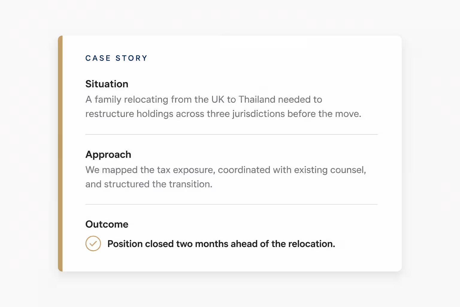
Lead with the situation, the approach, and the outcome, stripped of identifying detail. A card on the site reads like this:
"A family relocating from the UK to Thailand needed to restructure holdings across three jurisdictions before the move. We mapped the tax exposure, coordinated with their existing counsel, and closed the position two months ahead of the relocation."
No name, no logo, and a buyer can still see exactly how you'd handle their situation.
A methodology page works the same way at a higher level. Show how you work without publishing the operational detail. 69% of B2B marketers consider case studies their most effective form of content. Discretion is not a reason to skip the single format they most want to see.
Treat methodology and anonymised case studies as things a serious buyer explicitly looks for: how the firm works, and who it has helped.
How do Western and expat buyers read your site?
So what happens when the buyer can't visit your office? The site becomes the stand-in for how well-run your firm is. Correct, professional English, clear structure, and visible process are the clearest signals available to a Western or expat buyer.
It's not only the human buyer reading the site this way anymore. AI tools are increasingly used to shortlist and assess firms before a person ever gets involved, and they rely on the same signals: clear structure, specific language, visible credentials.
Final thoughts
Your reputation is what gets you the referral, and our website is what a stranger uses to decide whether that reputation holds up before they'll book the first call.
That second step is where good firms lose prospects they never met. This is because a cautious buyer found a vague or dated site and decided the safer bet was the bigger name with the clearer one.
The quickest way to know how your site reads to a referred prospect is to have someone check it for you. Request a website review and Superpresence will show you where it builds trust and where it's costing you enquiries.
FAQs
Do I really need case studies and testimonials if most of my work comes from referrals?
Yes, and the referral is the reason. The referred prospect looks you up to confirm the recommendation, and case studies top the list for B2B marketers, with 69% naming them the most effective form of content they use. Anonymised stories work perfectly well, so confidentiality is no excuse to skip them.
How do I show client results without breaking confidentiality?
Anonymise the client and lead with the situation, approach, and outcome. "A family relocating from the UK to Thailand" does more work than a named logo you're not allowed to use. Keep your methodology at framework level rather than step-by-step, and you stay well inside compliance.
Is a simple, boring website better than a fancy one for professional services?
Yes, a plain site with clear positioning, real bios, proof, and a visible methodology outperforms a glossy site with vague copy. Serious buyers are looking for substance they can assess.
How do Western or expat clients judge an Asia-based accounting or tax advisor online?
They can't visit the firm's office in person, so a clean and straightforward website does the convincing instead. This comes from general B2B research, not a study of accounting firms specifically, but the pattern holds. Local expertise should stay visible too, since that's often why they wanted a firm on the ground.


![Portrait of a Kevin D Chen [Dark]](https://cdn.prod.website-files.com/6963b46b73d13c416619d604/696770db31b454394fd4709a_43e4f0a4b187c1f51dd5024dd9980a60_kevin-photo.avif)