What your startup website needs to win users and investors

Investors judge your website through the same lens your users do: can I tell what this is, does it look like a team that ships, would I actually sign up?
Win the users, and that same site does most of the work of convincing investors. Most of that comes down to execution: whether the site started as a stitched-together template or came from a web design agency built to hold up under both reads at once.
For most startups, traction, team, and market story belong in a strong About section, not a separate page. Here's what each audience needs, where they converge, and where they genuinely differ.
What your visitors need before they sign up
Users decide quickly whether your product is for them. Here are four things that’ll help them sign up to try your product:
- Benefit-first copy: What the visitor gets, in their words, above the fold. The outcome they came for, stated plainly
- One obvious next step: The sites that convert tend to lead with a single primary call to action, like "Try demo" or "Join waitlist.” One clear action beats five competing ones
- A look at the real product: A screenshot, a short clip, something that shows the thing working. People trust what they can see
- Proof from someone like them: A testimonial with a name attached, a logo they recognise, a number they believe
If a buyer can't map your headline to their problem in seconds, they leave instead of signing up or trying out your product. A hero stuffed with abstract, enterprise-sounding language flatters the founder who wrote it. The buyer just can't tell what it means.
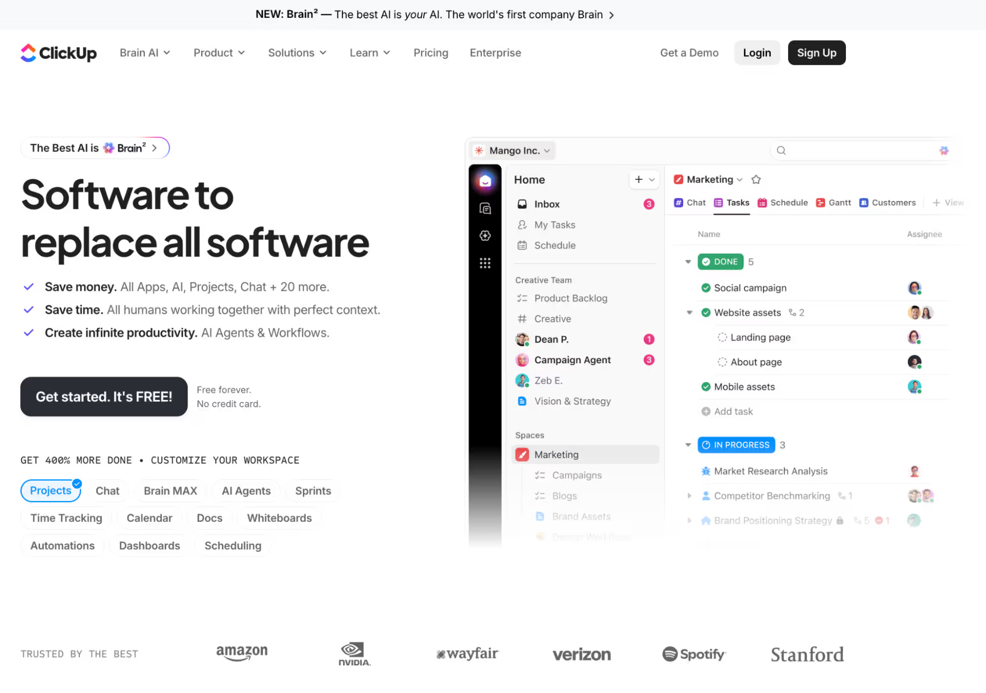
ClickUp's homepage is what these four things look like built. The headline states the benefit, one button owns the page, the product sits right there instead of being described, and six recognisable logos do the trust-building a testimonial usually carries.
What investors are actually reading when they open your site
An investor opens your site asking whether this is big, whether you can execute, and whether the team is real. Then they go hunting for what the product does and whether anyone's using it.
Three questions are running underneath:
- How big is this? A real market, or a feature dressed up as a company
- Can this team execute? Does the site itself look like people who ship
- Is anyone using it? Traction they can believe, in real numbers
For the credibility read, investor guides converge on a minimum set of trust signals: customer logos, case studies, and traction or press stats. And they treat visual quality and site performance as a sign of how well the team builds.
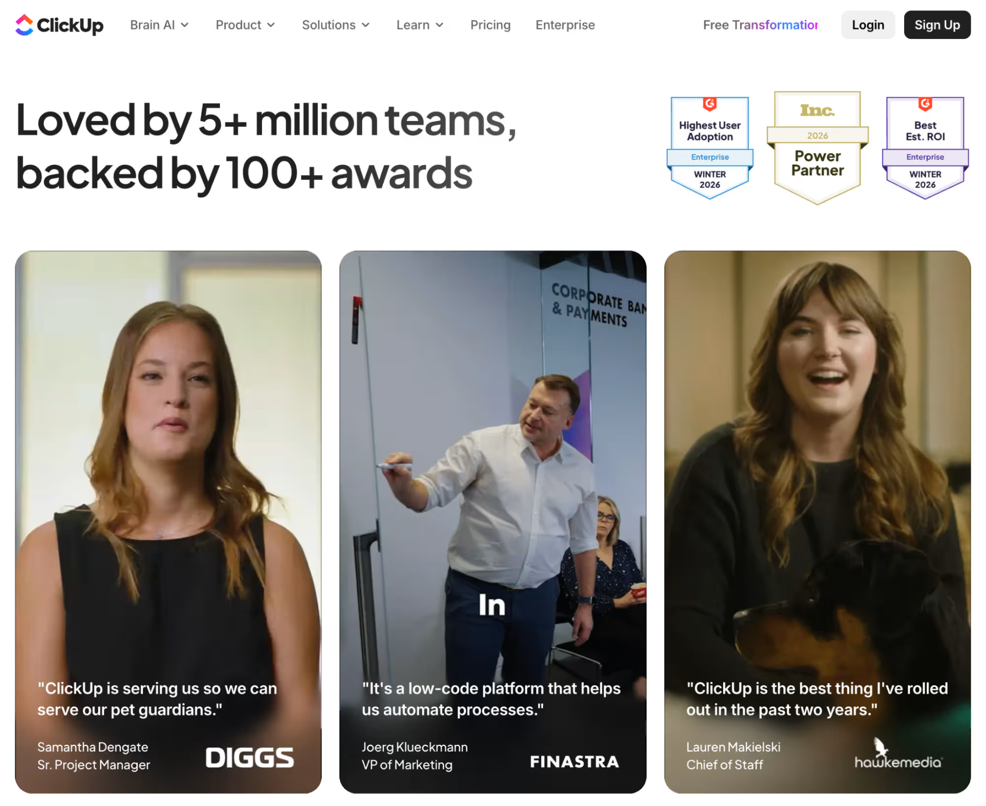
"5+ million teams" answers the size question before an investor has to ask it. That's not a feature's usage number. It's a market's.
The three 2026 award badges do the execution read. Independent recognition like G2 and Inc says the product ships well enough for outsiders to notice.
And the traction comes from named people: a Sr. Project Manager at Diggs, a VP of Marketing at Finastra, a Chief of Staff at Hawke Media. Real titles, real companies, on camera. That's traction an investor can believe.
A site that wins users has already done most of the investor's job
Investors aren't really grading your website. They're using it to guess whether this is a useful product solving a real problem for real users.
So a homepage that clearly sells the product and onboards people cleanly is the evidence. It shows market understanding and execution in a single move. Win the user, and you've already answered most of what an investor came to ask.
This is where the two audiences stop being two. The clarity that makes a buyer sign up is the same clarity that tells an investor the market will understand this. The same working flow that converts a user shows you can build it.
I see the opposite constantly when we review sites: the deck-site. The founder ports the fundraising narrative straight onto the homepage. The hero leads with a $40B market and a promise to reinvent it, and the product itself sits halfway down.
Users bounce because they can't see how this solves their problem today. Investors have to work to figure out what the thing even does, which is the opposite of the fast, confident read you want.
In this pattern, a founder rebuilds a vision-first homepage into a benefit-first one. It leads with what the product does and a clear way to try it, and both numbers move. User signups climb, and so does the investor's read of the same page.
Craft and signup flow are execution evidence, not polish
Design and the signup flow are how an investor reads your ability to build. An investor who clicks "sign up" after your pitch and lands in a clunky multi-step form sees that friction as a red flag, and leaves.
Two habits cause most of it. The first is treating the signup or waitlist flow as an afterthought, so a crisp homepage hands off to a raw Google Form and a manual invite days later.
The second is handing the marketing site to the in-house product designer. The problem with that is they'll ship something genuinely beautiful, but often miss the messaging hierarchy, the obvious CTA, and the proof an acquisition site needs.
Craft pulls in the same direction. A coherent site is easier to remember, and that works for your favour too. And "we'll clean up the flow after the round" gets the order backwards. The flow is part of what you're being judged on during the round. This is exactly what a website review looks at.
So do you actually need a separate investor page?
For most SaaS and tech startups, no. A homepage that converts users, plus a strong About section, gives an investor more signal than a thin investor-only page ever could.
A separate page tends to say less, because it's disconnected from the thing that actually proves you out: users choosing the product.
So put the investor content where it belongs, and let the About section do double duty. Concretely, that means:
- Team expertise. Relevant domain experience, prior roles at companies an investor recognises, technical depth that maps to the problem you're solving
- Track record. Previous exits, products shipped, teams built, anything that shows this isn't the founders' first attempt at building something real
- The founding story. Why this team, why this problem, why now. The market framing an investor wants belongs here too, woven into the story rather than pitched on its own
Now the advice doesn't fit everyone, and a few real exceptions are worth naming. First is genuine deep-tech, where the buyer isn't self-serve and the product is a decade of research.
There's also the investor who doesn't trust polish. This is common among developer-tool and infrastructure investors, where a plain site can actually feel more trustworthy than a slick one.
A third case is pre-product-market-fit, bootstrapped teams, where saving cash can rightly beat optimising conversion, at least until you're paying for traffic or raising a funding round.
That's usually the point where custom web design services start paying for themselves, once real spend or investor scrutiny is riding on the site.
Your site is your pitch
The founder whose site is basically a readme pasted into Webflow doesn't need an investor page. They need the one site to be good, clear enough that a buyer signs up and an investor stops asking what the product does. Build that once, and you stop choosing which room to win. You're in both.
The quickest way to know which room your site is already winning is to have someone read it cold. Request a website review and we'll show you exactly where your site wins users, where it loses them, and what an investor takes away from the same page.


![Portrait of a Kevin D Chen [Dark]](https://cdn.prod.website-files.com/6963b46b73d13c416619d604/696770db31b454394fd4709a_43e4f0a4b187c1f51dd5024dd9980a60_kevin-photo.avif)