Website navigation best practices that turn visitors into buyers

Your website navigation should help visitors find what they need quickly and understand what you offer. But many menus are built around the company's internal structure rather than the questions buyers arrive with.
The result is often a menu that's harder to scan, unclear labels, and important pages that are difficult to find.
Website navigation best practices start with a few decisions: what belongs in the menu, how many items it should have, what each label should say, and how the menu should work across desktop and mobile.
This guide covers those decisions, along with accessibility, SEO, and the site structure underneath the menu, the same ground we cover when scoping web design services for a client.
What good website navigation does
Website navigation is the set of menus, links, and labels that do two things. It gets people who already know what they want to the right page quickly. It also gives everyone else a quick sense of what you offer and who you serve.
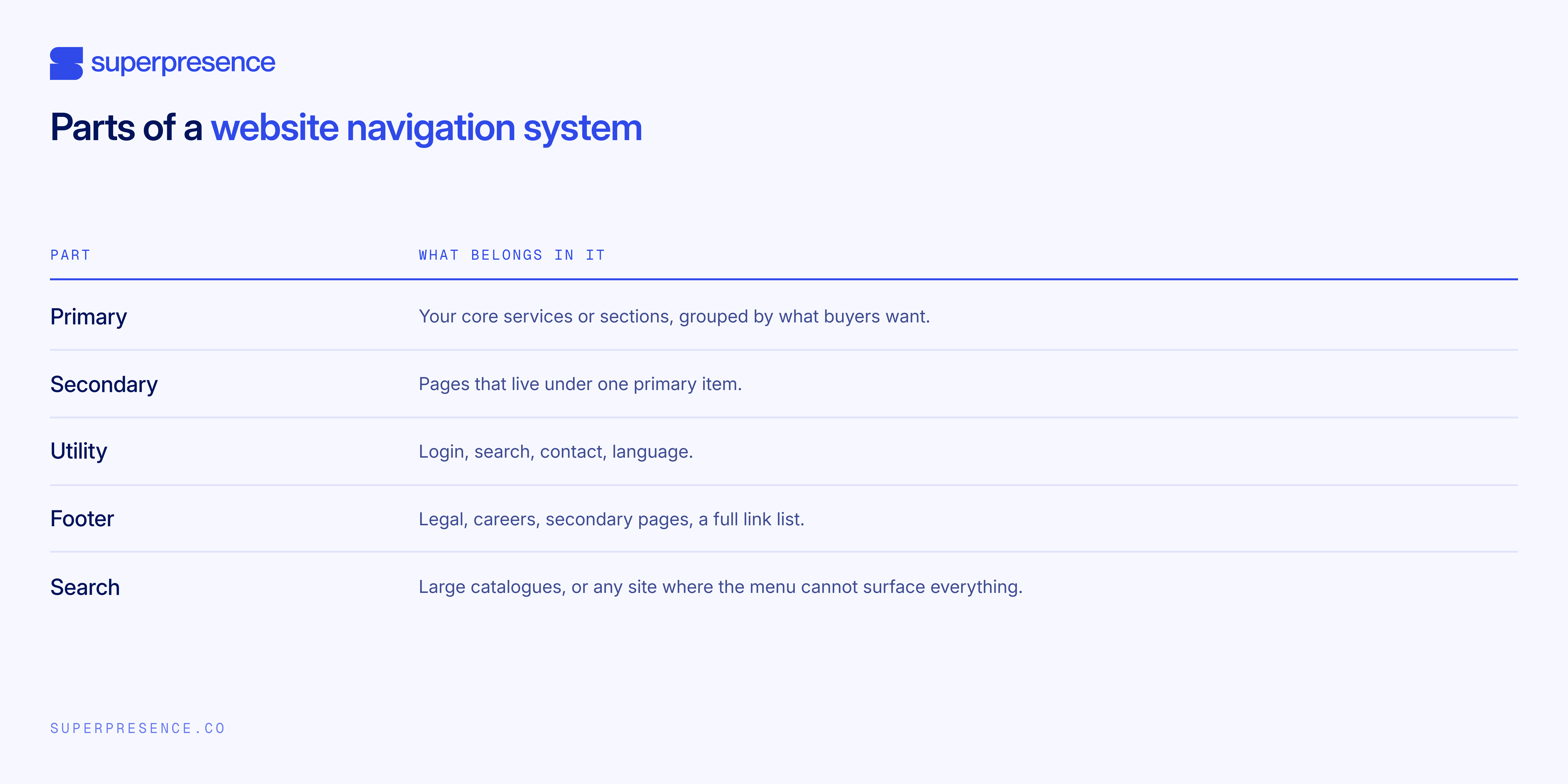
Most founders don't think about how many parts a navigation system has. Here's what each one does.
Your menu also helps Google discover and understand your pages. It creates links between important sections of the site and can affect how easily deeper pages are reached.
Six signs your menu needs work
You don’t need a research budget to know your menu is failing. Six signs give it away, and most websites have at least two.
- People use your on-site search to find things that are already in the menu
- A top-level item gets little or no traffic
- Sales has to explain your services on the first call, every time
- Three top-level items could all reasonably contain the same page
- The menu has grown one item at a time because someone inside the business asked for another link
- Mobile visitors rarely open the menu
Your analytics can help confirm these patterns. Look at menu clicks, internal searches that match your own labels, and the pages where people leave. GA4 or Hotjar can help you see where visitors are struggling.
If you want to know how your own menu holds up, request a website review and we'll walk your site the way a first-time visitor does, then show you exactly where the menu slows them down.
Choose what goes in the menu
Start with what visitors are trying to find or do. Your company's internal structure can still shape the menu, but it shouldn't be the only consideration.
One useful exercise is to review every label from a buyer's perspective. Read it out loud and ask whether someone outside the company would understand it. If a label only makes sense to people who work there, consider replacing it with a term that describes the service or problem more clearly.
Having five to seven top-level items is a practical ceiling, based on working-memory limits and echoed across current UX guidance.
Services, products and solutions are a common example of where structure can become unclear. If several categories could contain the same page, visitors may struggle to understand the difference too.
The fix is to give each page one home. If a page could sit under either label, decide which term a buyer would click first, put the page there, and drop it from the other menu.
For example, a client onboarding page could sit under either "Services" or "Solutions." If most visitors search for what you do rather than what you call it, keep the page under "Services" and remove the duplicate link from "Solutions."
A useful check is to count the clicks from your homepage to your deepest important service page. Three or fewer is a good target. If an important page takes five clicks to reach, it's worth looking at whether you can create a clearer route.
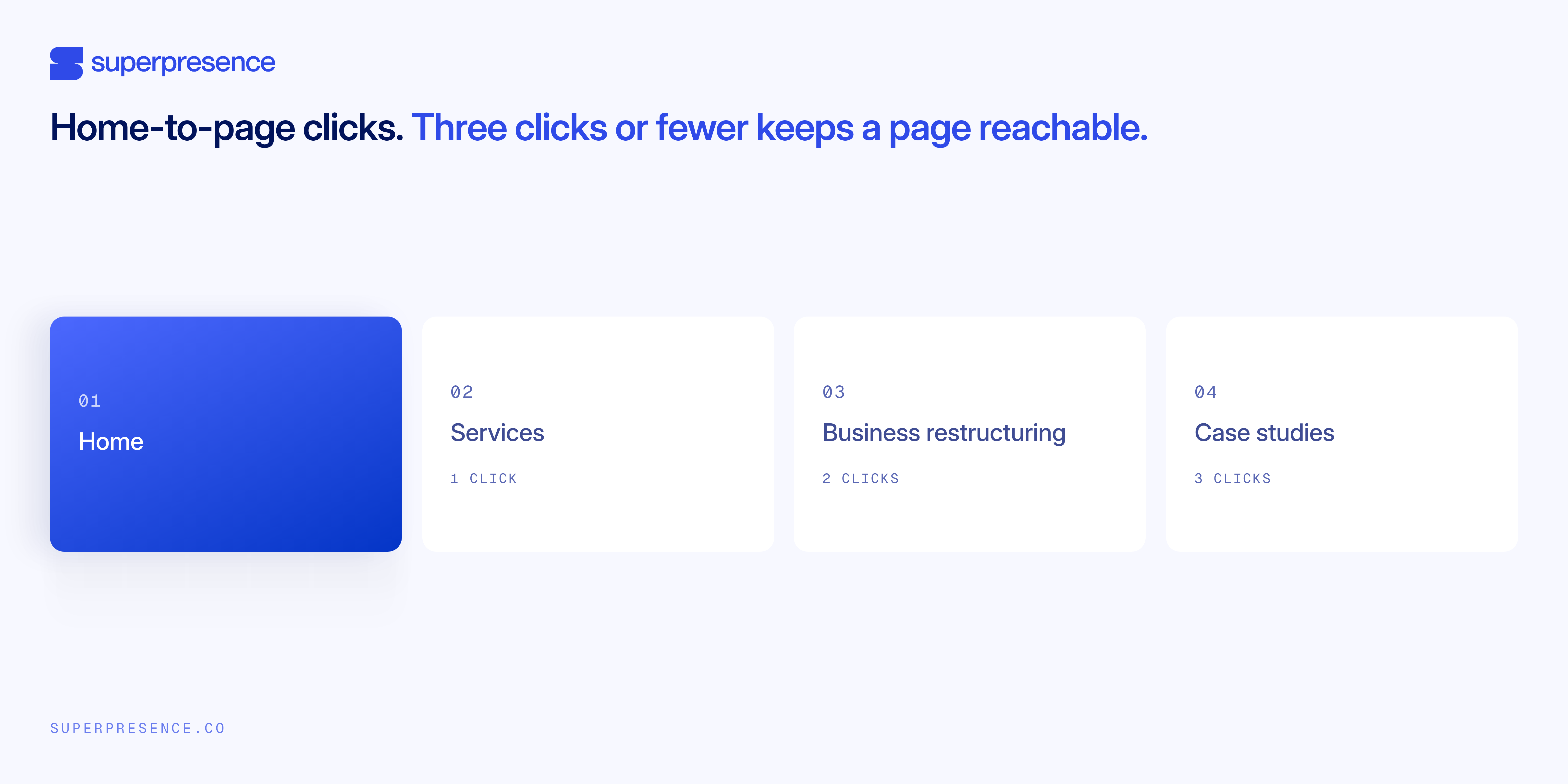
That's what the three-click target looks like end to end: one click from the homepage to Services, a second to Business restructuring, a third to the specific case study a buyer's actually looking for.
Write clear labels and choose one action
Use labels that clearly describe what visitors will find. Then give the header one obvious next step.
Use clear labels
Descriptive labels make navigation easier to understand. A visitor scanning a menu should be able to guess what's behind a label before they click it. "Case studies" tells them what they'll find. "Our work" leaves them to work it out.
A label should also match the page it leads to. If you call something "Pricing," visitors should find pricing there. If "Resources" contains useful guides, make sure the section reflects that purpose.
Resend follows this rule: one of the top-level menus, Features, uses clear labels on what they have to offer, from Email API to Dedicated IPs.

Use the words people search for
Two simple research methods can help you find the words people actually use. The first is card sorting. Write each service on a separate card, such as “tax filing,” “audit support,” and “business restructuring.”
Ask five or six people outside your company to group the cards in a way that makes sense to them. If most people put “tax filing” and “audit support” together, they may work better under one menu label.
The second is tree testing. Show people a plain list of your menu labels without the website design. Then ask them where they’d click to find something, such as “book a consultation.” If people hesitate or choose the wrong label, that label may need to be changed.
Choose one clear action
The header gets one primary action, phrased as the concrete next step. "Book a consultation," not "Discover." This is the single most-seen conversion element on your whole site, and a vague word wastes it. Give it enough visual weight to get clicked without turning the header into a billboard.
Make the menu easy to use
A clear structure and simple labels are only part of good navigation. The menu also needs to work well on the device people are using.
Fix dropdown menus
Hover-only dropdowns can be difficult to use, especially on larger sites. A small mouse movement can make the submenu disappear before someone can click it.
Use click-to-open submenus instead. Make the hover or click area large enough to handle normal mouse movement. On larger sites, active menu states and breadcrumbs can also help people see where they are.
Use hamburger menus carefully
Keep your top-level links visible on desktop. Hiding them behind a hamburger icon means fewer people open the menu at all, and the ones who do take longer to find what they need.
Mobile is different: a hamburger works there, especially when it's labelled "Menu" rather than left as an icon alone.
Make mobile navigation work
Mobile navigation is its own system. Treat it as a compressed desktop menu and the tactics below go wrong.
- Size tap targets, the area a thumb has to hit, to a minimum of 24×24 CSS pixels, with roughly 48×48 being comfortable
- Put core destinations within thumb reach, well clear of the top corner
- Never cut the CTA on mobile because it’s the one thing that always earns its space
Make navigation accessible
If your menu only works with a mouse and good eyesight, you’re turning away people who could buy. You’re probably failing a Web Content Accessibility Guidelines (WCAG) requirement while you do it. Most of the fixes are small.
Keyboard operation and focus order
The order the Tab key moves through the page. Test it yourself: put the mouse down, press Tab, and check you can reach every menu item and get back out. A dropdown that traps Tab fails on the spot.
Skip links
A link at the top of the page that lets someone jump straight past the menu to the content. It's a basic accessibility requirement, and simple for a developer to add
Real code underneath
Use actual links and an actual list in the code, so a screen reader and the keyboard can follow them. Styled boxes that only behave like links break that. Extra accessibility attributes can help a complex menu and can just as easily break a simple one, so leave that to a developer.
Colour, contrast and state
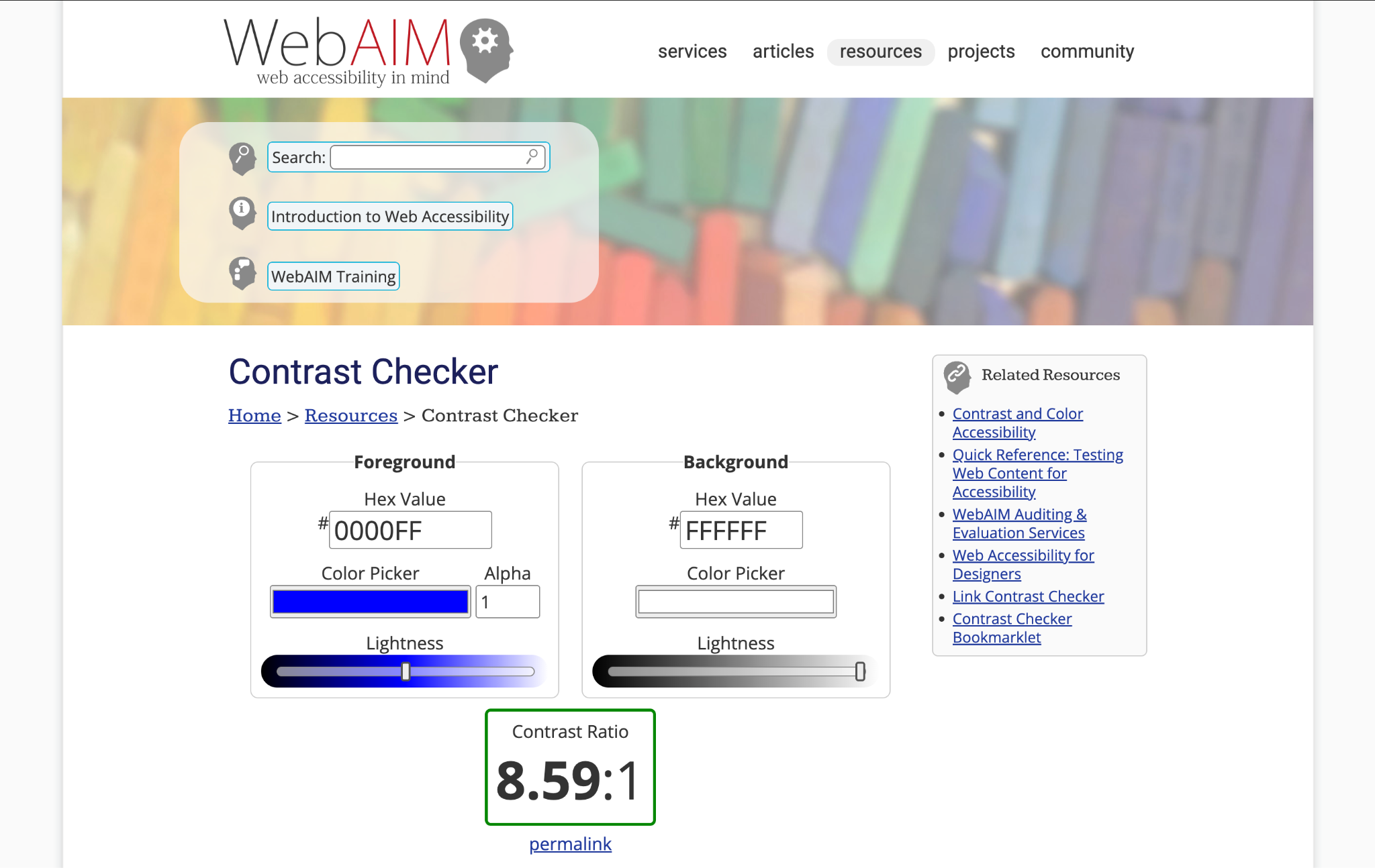
Active and focus states that meet WCAG's contrast rule for interface elements, at least a 3:1 ratio against the background for things like a nav link's underline or outline.
A free tool such as WebAIM's Contrast Checker, or the accessibility panel in a browser's dev tools, checks this in a couple of minutes.
Some people assume their customers don't need this, but that's rarely true. Some buyers use a keyboard instead of a mouse, some read at low contrast, and all of them are trying to reach your contact page. Accessible navigation means more of them get there.
Navigation affects your business
Website navigation best practices come down to a few things, done consistently: labels that match how buyers think, a structure that gets them there in three clicks or fewer, one clear action in the header, and a menu that behaves the same way on every device.
Get those right, and more of the right people reach your contact page. Get them wrong, and you're the one re-explaining your services on every first call instead of the site doing it for you.
You don't have to guess which of these your own site gets wrong. Request a website review and we'll check whether your menu matches how buyers actually think about their problem.
FAQs
What makes good website navigation?
A few things, put together: labels that match how buyers think rather than internal team names, a short list of top-level items instead of one that's grown by accretion, one clear action in the header, and a menu that works the same way on mobile as it does on desktop.
How many items should a website menu have?
Five to seven top-level items is the working range, because scannability and working memory break down past that. Four clear items beat six padded ones. Large catalogues are the exception, where a wider menu can help people find things.
Should navigation go at the top or the side?
Top navigation suits most business and service sites with a handful of destinations. Side navigation earns its place on apps, documentation, and content-heavy sites with many categories. Match it to how many destinations you have and how people move through them.
How are website navigation and a design system related?
Both exist to make a site behave the same way everywhere. A design system keeps the components consistent, buttons, spacing, colours. Navigation keeps the structure consistent, what's in the menu and how it's grouped.
Does website navigation affect SEO?
Yes. It sets the route Google takes through your site, decides which pages the ranking weight lands on, and on many sites is the only internal linking there is. That’s why the click depth from your homepage to your deepest page is worth checking.
![Portrait of a Kevin D Chen [Dark]](https://cdn.prod.website-files.com/6963b46b73d13c416619d604/696770db31b454394fd4709a_43e4f0a4b187c1f51dd5024dd9980a60_kevin-photo.avif)